 typehaus/metropolis
Minimalist, modern, geometric typeface designed by Chris M. Simpson.
Maintained and distributed as a webfont by Nicholas Berlette and typehaus.org.
pnpm add @typehaus/metropolis # yarn add @typehaus/metropolis
Usage
typehaus font packages such as Metropolis are all made with versatility, compatibility, and performance as the primary objectives. That being said, you have many different options available to you to add Metropolis into any project/workflow you want.
Webfonts - woff, woff2
If your project is managed by npm / yarn / pnpm and contains a package.json, the easiest way to add Metropolis is to install it from the NPM Registry to your project's dependencies.
Make sure it's not in
devDependencies— otherwise, bundlers like Rollup / Webpack will exclude it from the prod. bundle!
Importing
You can just import the whole family (if you're into that sort of thing).
import '@typehaus/metropolis'
This will import ./index.css, which itself imports each weight from 100.css to 900.css.
"Tree-shaking" and Asset Aliases
You can even import individual weights - which is highly recommended, and helps cut down on your final bundle size.
Both the normal and italic style are included in each weight, and both the keyword or numeric filename work just fine. In the cases like ExtraLight and ExtraBold, I've included a few common aliases such as xlight.css and bolder.css.
100, Thin
import '@typehaus/metropolis/100.css'
import '@typehaus/metropolis/thin.css'
200, Extra·Light, X·Light
import '@typehaus/metropolis/200.css'
import '@typehaus/metropolis/xlight.css'
import '@typehaus/metropolis/extralight.css'
import '@typehaus/metropolis/lighter.css'
300, Light
import '@typehaus/metropolis/300.css'
import '@typehaus/metropolis/light.css'
400, Book, Regular
import '@typehaus/metropolis/400.css'
import '@typehaus/metropolis/book.css'
import '@typehaus/metropolis/regular.css'
500, Medium
import '@typehaus/metropolis/500.css'
import '@typehaus/metropolis/medium.css'
600, Semi·Bold
import '@typehaus/metropolis/600.css'
import '@typehaus/metropolis/semibold.css'
700, Bold
import '@typehaus/metropolis/700.css'
import '@typehaus/metropolis/bold.css'
800, Extra·Bold, X·Bold
import '@typehaus/metropolis/800.css'
import '@typehaus/metropolis/xbold.css'
import '@typehaus/metropolis/extrabold.css'
import '@typehaus/metropolis/bolder.css'
900, Black
import '@typehaus/metropolis/900.css'
import '@typehaus/metropolis/black.css'
Implementing in CSS
Now you just need to add it to your actual CSS!
html, body {
  font-family: 'Metropolis', -apple-system, BlinkMacSystemFont, 'Segoe UI', Roboto, 'Open Sans', 'Helvetica Neue', sans-serif;
}
The additional font families are “emergency backups”... that way, in the terrible (and unheard-of) event that your fonts don't load, your users won't be stuck with
Times New Roman.
Importing into CSS
Any of the above JavaScript imports will often also work inside your project's CSS, by using @import instead of import:
/* example tailwind.css */
@import "@typehaus/metropolis/800.css";
@tailwind base;
@tailwind utilities;
@tailwind components;
What's in the stylesheets?
Each stylesheet of the numeric naming convention contains two @font-face rules (one regular, one italic). In each of those rules is Metropolis in that weight + style, formatted as woff + woff2, and encoded in base64 + utf-8. All the other CSS files simply contain @import rules which reference their associated numeric weight's file.
Using a remote CDN
Some scenarios might preclude the ability to self-host your font assets. In those situations, you can always use a remote CDN service like unpkg.com or jsdelivr.net:
import 'https://unpkg.com/@typehaus/metropolis'
The shorthand format above is intended for rapid prototyping in development environments only. Since it's using a non-deterministic asset path, its content is not definitively known nor guaranteed to remain the same. Also, if a breaking change is published, your project could suddenly break and be stuck on Times New Roman without any warning 😰
For production, you always want to pin the package version (that means no ^ or ~ or * semver prefixes), and use the long-form URL for any assets. This implies including all file extensions.
As an example, this URL will always resolve to the exact same version of 100.css from v12.0.0-next.7:
import 'https://cdn.jsdelivr.net/npm/@typehaus/metropolis@12.0.0-next.7/100.css'
Local Install - otf, ttf, ttc
You may wish to use Metropolis on your own computer. Personally, I use it for some graphic design projects in Adobe Photoshop and Illustrator (macOS), so I needed something other than webfonts to install locally.
Included the typehaus release are font files in OpenType format (.otf), TrueType (.ttf), and a single TrueType Collection (.ttc). The .ttc is a nice option because all of the different weights have been compiled into a single file - the Metropolis Collection - which makes installation a breeze.
You can download the assets directly from our GitHub Repository.
If you're running macOS, just drag and drop into FontBook.app. Or, run this command in terminal to download and add it to your Font Library:
curl -fsSL https://cdn.jsdelivr.net/gh/typehaus/metropolis/dist/ttc/Metropolis.ttc -o ~/Library/Fonts/Metropolis.ttc
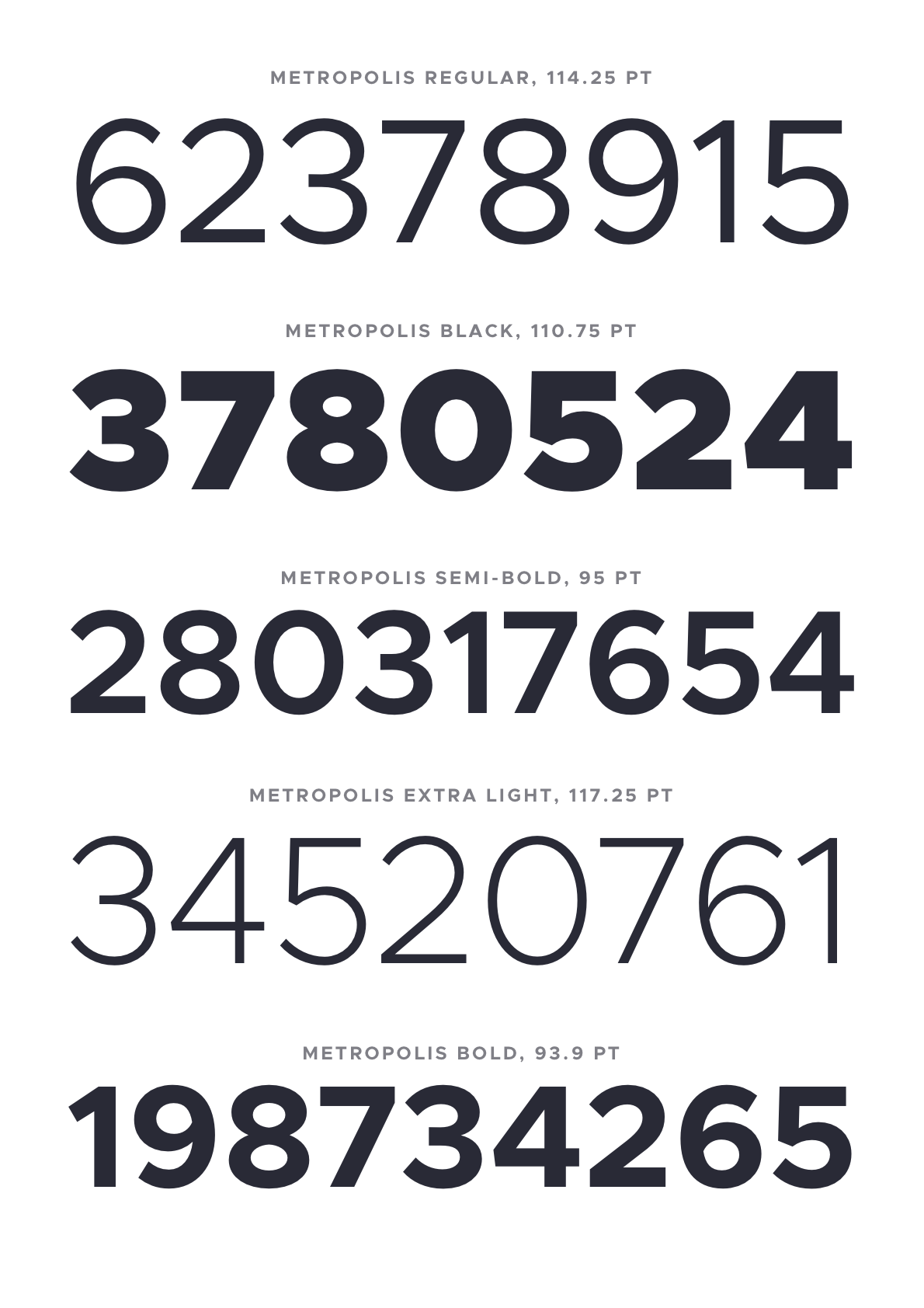
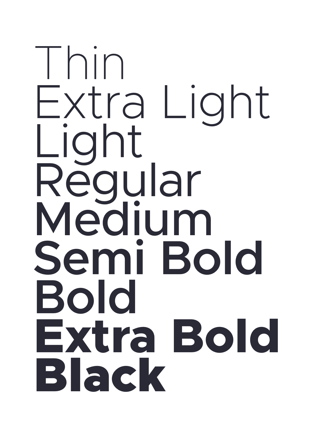
Specimens
Metrics
Given an em square of 1000, the metrics for Metropolis are as follows:
| Metric | Value |
|---|---|
| Ascender | 795 |
| Cap Height | 687 |
| X-Height | 517 |
| Descender | -205 |
Italics
The italics angle is universally 11.75°.
Dimensions
| Light | Regular | Black |
|---|---|---|
 |  |  |
Also known as
stroke width.
Example: If drawing something like an
x, I likely will start with an elongated vertical bar with the same width as the vertical stem inn. After rotating it the appropriate width to create the letterxof the desired width, a lot of adjustment takes place. The final result cannot be reasonably estimated something akin tostroke width y at a degree of z. This is essentially how all diagonals have been drawn to date. Start with an initial shape based off these dimensions and then infinite adjustment.
Alignment Zones
Also across all current 6 masters, the alignment zones are +/- a value of 12. This is a good value for this style of sans typeface for an em square of 1000, so I'll often use a value of 12, not just for Metropolis.
There likely should be many more formal values, but they don't exist. Pretty much all glyphs have been improvised beginning with the pen tool in Glyphs. I didn't draw this freehand as a prior step, becuase I wanted to get straight into the project in Glyphs. Maybe that's a 'wrong' way to do type design, but it works for me. That will explain why some outlikes are a bit primitive. For example, I'm still not really happy with the lowercase a overall, but I am reluctant to change it to something already familiar over something original. This is an original work, not a copy, after all.
Armed with all the above metrics, you should be able draw a great many number of outlines/glyphs. There are 327 already there by my count. I say outlines, I have intentionally left out spacing until now.

Workflow
Metropolis is built with an entirely Glyphs.app based workflow. I can't recommend Glyphs enough, though it does come with a price tag.
The two plugins that are essential to this workflow are HT Letterspacer and BubbleKern. More on both those below.

HT Letterspacer
Checkout the HT Letterspacer website for a much more thorough explanation.
HT Letterspacer is a tool that automatically calculates the appropriate left and right bearing on any glyph, essentially doing the spacing part of the design automatically.
In order for this to work, the plugin requires a few parameters, which can be found in the custom parameters in the masters tab of the font info window, namely paramArea, paramDepth, paramOver.

Parameters
| Metric | Thin | Regular | Black |
|---|---|---|---|
paramArea | 350 | 310 | 370 |
paramDepth | 5 | 7 | 16 |
paramOver | 2 | 9 | 22 |
I roughly understand what these numbers do, but I'm not going to explain how I've arrived at these specific values. A lot of fiddling, adjusting, and trial and error.
Autospacing
In addition to this, each *.glyphs file needs a corresponding autospace file.
For instance, with Metropolis Regular:
./Metropolis.glyphs
./Metropolis_Black_autospace.py
./Metropolis_Regular_autospace.py
./Metropolis_Thin_autospace.py
And Metropolis Italic:
./Metropolis-Italic.glyphs
./Metropolis-Italic_Black_autospace.py
./Metropolis-Italic_Regular_autospace.py
./Metropolis-Italic_Thin_autospace.py
Note: You will actually need a relatively new version of HT Letterspacer as I actually submitted a PR allowing masters/weights to have individually set values. (As far as I understand) the param values define overall weight (and/or rhythm) of the typeface, whereas the autospace file defines ratios between things like uppercase, small caps, lowercase, numbers etc.
User Interface
Once both the plugin and these settings are correctly set up, you can invoke the tool either with or without the User Interface (UI). The UI allows you to manually override settings (which is not what we want), so I choose to always invoke it without the UI. Once invoked, you can easily repeat the operation with Option + Command + R.
![]()
When using this tool/making spacing adjustments, it's key to run it many times. You will see the glyphs coalesce into their eventual spacing, but it may actually take multiple runs of the tool for it to reach it's optimal point.
BubbleKern
After drawing and spacing our glyphs, we need to define approriate kerning information. This would be a mammoth job to do manually each release, so instead I'm using BubbleKern. If you think back to days of old physical type, imagine the 'bubbles' being the shaped physical block the glyph is mounted on. The block itself is contoured outside of the perimeter of the glyph to allow glyphs tightly align.
Basically for each outline layer, there needs to be a corresponding 'bubble' layer (see right hand side Layers pane).
It is crucial the width of the corresponding layers are the same (e.g. the Thin layer and it's immediately following bubble layer) for this to work correctly.
Once defined/drawn for every glyph, BubbleKern is then run. I have prepared Metropolis BubbleKern Pairs.txt for this. Any kern pairs must go in this file. BubbleKern must only be run using this file.
As a guide, I am using 56, 53, and 50 as offset values when drawing the kern bubbles for Thin, Regular, and Black, respectively. As a rule, I try to honor the values already arrived at by HT Letterspacer.

Cursify
I'm largely using Glyph's 'Cursify' tool to do the italics. This yields better results that simply slanting the glyph shapes from the regular/normal glyph, though from memory I was doing something tricky like slanting the vertical bars and cursifying everything else.
Will update if/when I can recreate how I did this. Again, a lot of just eyeballing and trail and error.
| Cursify | Slant |
|---|---|
 |  |
Release Process
- Remove all kerning
- Draw
- Space
- Draw BubbleKern bubbles
- Re-Run BubbleKern (use
./src/Metropolis BubbleKern Pairs.txt) - Export
- Commit
- Create release tag
Note: Hoping to arrive at optimal BubbleKern outlines soon to negate the need to ever re-do these.
Export Formats
Once I've run BubbleKern, I create exports for OpenType, TrueType, UFO, EOT, WOFF & WOFF2.
Future Plans
Small Caps
There are some additional metrics that likely need to be defined before this can go ahead. There is an open PR for some caps, but I haven't reviewed and I'm not sure if spacing and/or kerning has been appropriately set.
Rounded
A rounded version. Adjusting strokes an addition 12 points at cap ends.
Slab / Serif
This one has had the least thought, but might be cool. Also could serve as some preliminary work for a possible monospaced version.
Monospaced
As above
Micro / Text / Display
This possibly would require an entire redrawing effort. The current metrics kind of work, but separating for different display sizes would likely need quite a rethink of the core metrics (and therefore spacing too). I don't really have any plans to do this. It's more of a "if I was doing this all over again..." type thing.
Alternatives to Glyphs
At present, the best bet is the UFO export. However, if you want to request glyph, you must raise an issue and add your modified file as an attachment to the issue, rather than a pull request. I will only allow PRs to the glyphs file.
This will in turn mean someone (likely myself) will need to translate this into an appropriate commit/PR.
Contributing
Please refer to these contribution guidelines before proceeding with a PR:
Submitting a Pull Request
We will only review PRs that are small and isolated and can be easily described and understood within the context of the PR rather than even needing to open it.
When saving the file for your PR close all other open tabs and leave one remaining with the added/modified glyphs visible. This makes it much easier to review PRs.
Guidelines
Please do:
- Run the autospacing on your modified/created glyph before submitting as a PR
- Add relevant bubble kern to any modified/created glyph and set up as drescribed above
- Apply to all weights and both normal/italic where appropriate
Please do not:
- Modify any autospacing settings
- Modify any other kern bubbles
- Set manual kerns (or indeed run the kerning tool at all)
- Modify any glyphs not related to your changes
As a general rule, a small isolated commit should equal a small isolated PR.